Table of Contents
The 3-Second Window
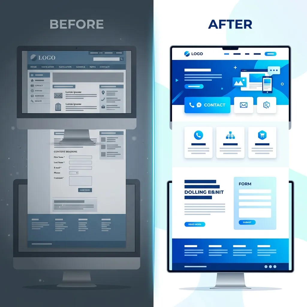
When a potential customer lands on your local business website, you have approximately three seconds to convince them that they are in the right place before they hit the "Back" button. Your homepage is the digital equivalent of your physical storefront's window display, the sign above the door, and the greeting from the front desk all rolled into one.
A beautifully designed website is useless if it doesn't clearly communicate value. We frequently audit websites that look like modern art galleries but fail to answer basic questions like, "Are you a residential or commercial plumber?" or "Do you actually service my specific neighborhood?"
To maximize conversions and turn fleeting clicks into actual ringing phones, your homepage must include several highly specific elements. Let's break down exactly what to include on a local business website homepage, section by section.
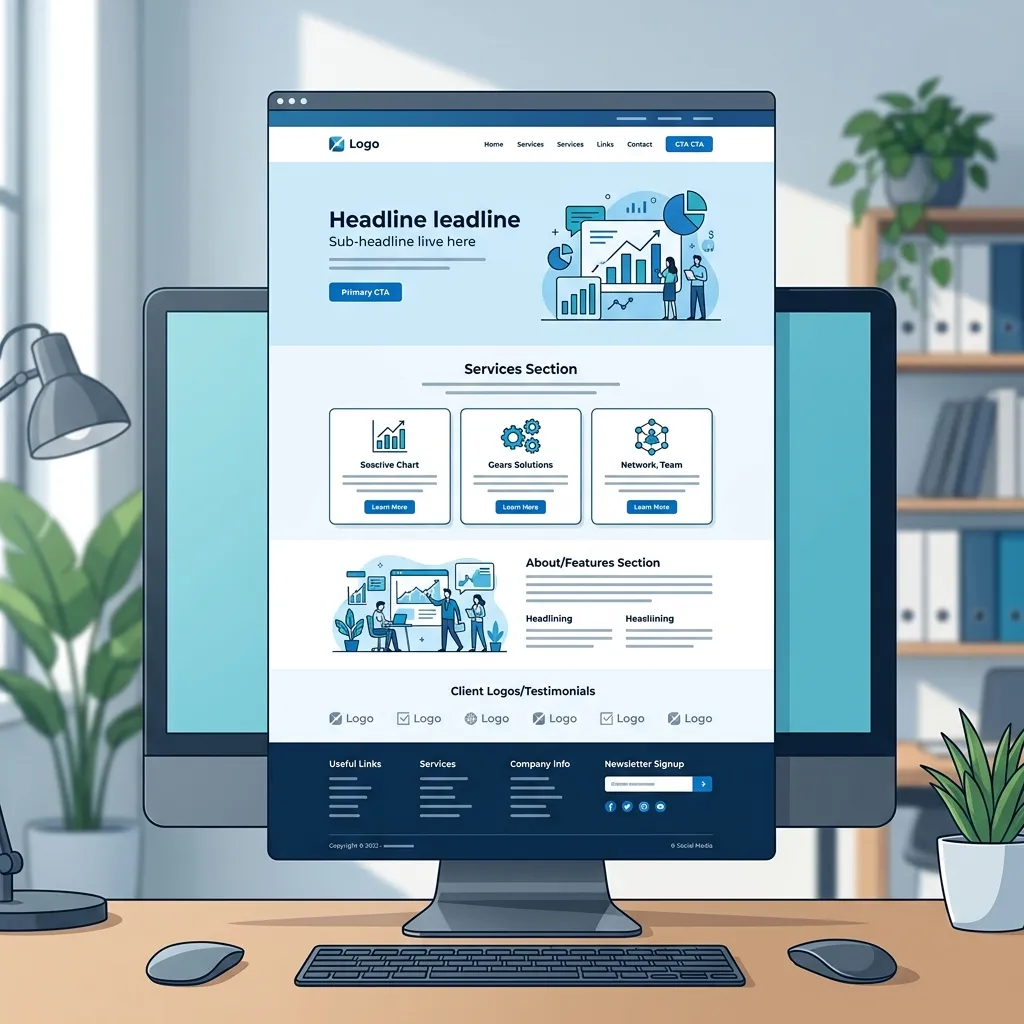
1. The Hero Section (Above the Fold)
The "hero" section is the very first thing a user sees before scrolling down. This is the most valuable real estate on your entire website. It must immediately and clearly answer three foundational questions:
- Who are you? (Your Brand)
- What exactly do you do? (Your Core Service)
- Where do you do it? (Your Service Area)
The Headline and Subheadline
Avoid clever, vague marketing jargon like "Empowering Your Vision." Instead, use stark clarity. A perfect, high-converting headline looks like this: "Dallas’s #1 Rated Emergency Roofing Company." It tells the customer the location, the specific service, and builds immediate authority.
The Primary Call to Action (CTA)
Directly beneath the subheadline, you must have a highly visible, brightly colored button telling them exactly what to do next. "Call for a Free Estimate" or "Book an Appointment" are infinitely better than a generic "Learn More." If you need help visualizing this, check out our article on why clear contact actions matter.
2. Services & Core Offerings
Right below the hero section, you need to provide a clear, easily skimmable breakdown of your core services. Customers don't want to read a massive wall of text to figure out if you handle their specific problem.
Use a clean grid layout or distinct bullet points. For example, if you run an HVAC company, your services section should have clearly separated cards with icons for: AC Repair, Furnace Installation, Commercial HVAC, and Routine Maintenance. Each card should link out to a dedicated page explaining that specific service in detail.
Need a homepage that actually converts?
We structure our custom website homepages specifically to maximize local leads and phone calls. Let us build you a digital storefront that works as hard as you do.
View Our Custom Website Packages3. Trust Signals and Social Proof
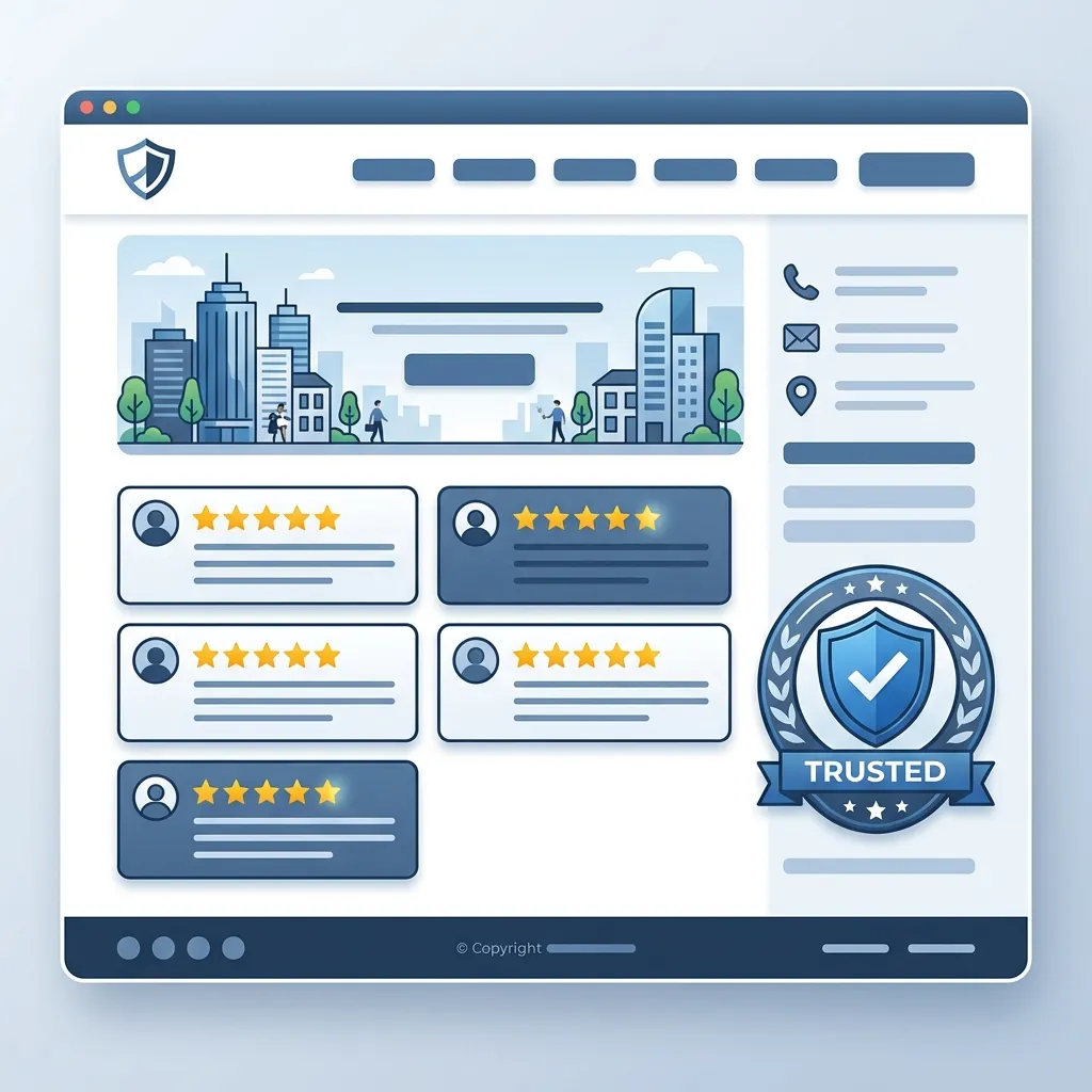
People buy from businesses they trust. Since they can't meet you face-to-face yet, your homepage must do the heavy lifting of proving you are a legitimate, reliable operation.
- Real Photography: Do not use stock photos of models in spotless overalls pretending to be mechanics. Use real, high-quality photos of your actual team, your branded trucks, and your storefront.
- Verified Reviews: Don't just type out quotes. Embed a widget that pulls your real 5-star reviews directly from Google Business Profile or Yelp.
- Trust Badges: If you are licensed, insured, bonded, A+ rated by the BBB, or a winner of a local "Best of" award, place those logos prominently in this section.
For a deeper dive into this psychological element of web design, read our comprehensive guide on making your website look trustworthy.
4. The "How It Works" Section
Customers feel anxious when they don't know what to expect. By outlining a simple 3-step process on your homepage, you remove friction and anxiety. A classic framework is:
- Step 1: Request a Quote (Call us or fill out our simple online form.)
- Step 2: We Assess & Plan (We visit your property and give you a transparent, flat-rate estimate.)
- Step 3: Problem Solved (We fix the issue quickly so you can get back to your life.)
5. Unmissable Contact & Location Info (The Footer)
Finally, the bottom of your homepage (and every other page on your site) must feature a robust footer. This acts as the safety net for users who have scrolled all the way to the bottom and are now ready to take action.
Ensure your exact physical address, a clickable phone number, your business hours, and a link to your contact form are listed clearly. Embedding a Google Map is highly recommended, as it allows mobile users to tap the map and instantly get driving directions to your storefront.
Frequently Asked Questions
Q: Should I put all my prices on the homepage?
A: Not necessarily. Your homepage should act as an entry point. You can list "starting at" prices to set expectations, but detailed pricing should live on a dedicated pricing or services page.
Q: Can I put a video in the hero section?
A: You can, but use extreme caution. Background videos often slow down page load speeds dramatically, especially on mobile devices. If a video causes your site to take 6 seconds to load, the customer will leave before they ever see it.
Conclusion: Clarity Over Creativity
When designing a homepage for a local business, clarity must always win over creativity. By prioritizing a strong hero section, clear service breakdowns, undeniable trust signals, and unmissable contact information, you transform your homepage from a simple digital brochure into an active lead-generation engine.
If you're overwhelmed by the technical details and just want a website that consistently brings in local customers, reach out to us at Crest Pages today.