Table of Contents
The Hidden Contact Info Problem
Imagine walking into a physical brick-and-mortar store. You find exactly what you want to buy, you are ready with your credit card in hand, but there are no cash registers, no employees on the floor, and no signs telling you how to pay. You wander around for two minutes, get frustrated, put the item back, and walk out.
When a local business website hides its phone number at the very bottom of a secondary page, or uses a broken email link, it creates the exact same frustrating experience for online customers. You have successfully attracted the customer, convinced them of your value, and then actively prevented them from giving you their money.
Startling Fact: Industry studies reveal that over 60% of small business websites do not have their phone number visibly displayed on the homepage without requiring the user to scroll down. This is a massive conversion killer.
In web design, a "Contact Action" (or Call-to-Action) is the specific button or link you want a user to click to initiate a business relationship. If these actions are unclear, your marketing budget is being wasted.
Mobile Behavior Changes Everything
When someone is searching for an emergency plumber, a tow truck, or a local restaurant on their mobile phone, they are usually in a hurry. They are not going to read your company's founding history or browse your blog (ironically!). They have an immediate problem, and they want to tap a button and hear a voice on the other end of the line immediately.
If your phone number is embedded as an image instead of text, mobile users cannot tap it to call you automatically. They have to try to memorize it, switch to their phone app, and type it in manually. This single mistake creates friction, and friction costs businesses thousands of dollars in lost leads every single year.
The "Thumb Zone"
Most people browse the internet on their phones using one hand, specifically their thumb. If your "Call Now" button is tiny, placed awkwardly, or requires zooming in to tap accurately without hitting another link by mistake, users will simply abandon the effort.
Are you losing mobile leads due to bad design?
Our custom websites feature sticky mobile navigation, instant click-to-call buttons, and optimized contact forms so your customers can always reach you with one tap.
View Our Website PackagesWhat Contact Actions Should You Have?
Different customers prefer different communication methods depending on their age, their location, and the urgency of their problem. A well-designed, high-converting website caters to all of them without making the screen look cluttered.
- Click-to-Call Buttons: Absolutely essential for mobile users. A high-contrast "Call Now" button should be present in the main header and repeated near the bottom of every single page.
- Short Contact Forms: For customers who are browsing late at night or have detailed inquiries they want to write out. Ensure the form actually delivers to your email (test it regularly!) and keep the fields to an absolute minimum. Name, Email, Phone, and Message. Do not ask for their home address unless it's strictly necessary for a quote.
- WhatsApp Integration: Increasingly popular globally and locally, a floating WhatsApp widget allows for immediate text-based chatting. It feels more personal and immediate than an email form.
- Google Maps & Physical Address: For businesses with physical storefronts (like cafes, salons, or retail shops), an embedded map helps customers calculate travel times instantly and confirms you are a real local entity.
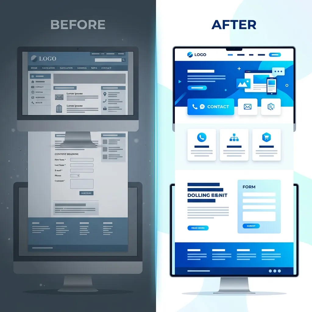
Visual Hierarchy: Making Contact Unmissable
It's not just about having the buttons; it's about how they look. This is called Visual Hierarchy. Your primary contact action should be the most visually prominent element on the screen.
If your website background is dark blue, your "Request a Quote" button should be a vibrant, contrasting color like bright orange or green. If a user squints at your website, that button should be the only thing that stands out clearly.
To learn more about how design impacts user trust and conversion, read our guide on What Makes a Local Business Website Look Trustworthy.
Frequently Asked Questions
Q: Should I put my email address directly on the website?
A: It's generally better to use a secure contact form instead of listing a raw email address (like info@yourbusiness.com). Raw email addresses get scraped by bots and lead to massive amounts of spam in your inbox. Contact forms protect your inbox while guiding the customer to provide the specific information you need.
Q: How many times should I ask the customer to contact me?
A: You should have a clear Call to Action in the top right header, in the main "hero" section at the top of the page, in the middle of the page after explaining your services, and at the very bottom in the footer. Do not make them scroll up to find the button.
Conclusion: Remove the Friction
In web design, friction kills conversions. By making your contact actions explicit, clear, and perfectly functional on all devices, you instantly elevate your business above competitors who force customers to hunt for a way to reach them.
If your website is currently hiding your phone number or relying on broken forms, it's time for an upgrade. Reach out to Crest Pages today to see how we can build a lead-generating machine for your business.